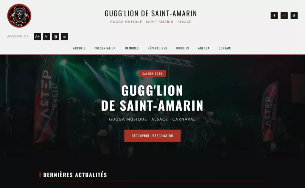
Websites
Gugg'Lion de Saint-Amarin
Le site de la gugga musique de Saint-Amarin : présentation, musiciens, répertoire, agenda et goodies.
Saint-Amarin
Our work · Market’Thur
Visual identity · Websites · 09.2026The agency’s brand: a tight logotype, the green apostrophe of the Thur, and a paper, ink and river palette.
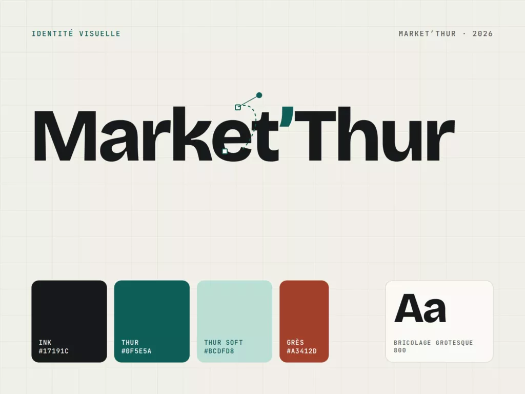
Show clients’ work at full size and sign discreetly. The identity grew out of the screen mock-ups used to present delivered websites.
A logotype in Bricolage Grotesque whose apostrophe takes the colour of the river, a five-colour palette, three typeface families, social media templates and this website.
See also
Websites
Le site de la gugga musique de Saint-Amarin : présentation, musiciens, répertoire, agenda et goodies.
Saint-Amarin
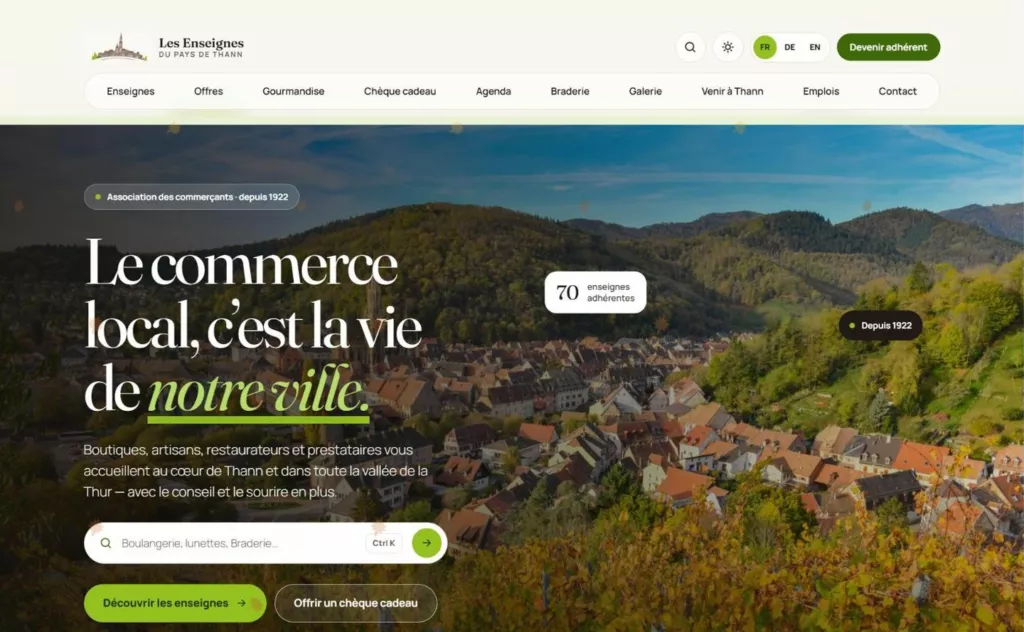
Websites
La refonte du site des Enseignes du Pays de Thann : annuaire des commerçants, bons plans, chèque cadeau et agenda, en trois langues.
Thann
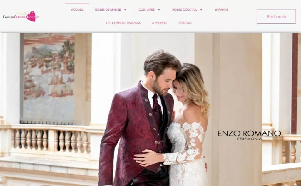
Search engine optimisation
Le référencement naturel de la boutique de robes de mariée du Parc de Wesserling, pour les futurs mariés de toute l’Alsace.
Parc de Wesserling
Tell us about your business. The first conversation comes with no commitment.
Accessibility
↑↓ navigate↵ openCtrl+K
No results. Try “website”, “drone” or “wedding”.